

Go-To Skincare
Uncomplicated, effective skincare.
-
From the iconic peach that unifies the many brand touch points; art direction that celebrates the natural ingredients, playfulness, inclusivity, joy of being yourself; the packaging; the fonts; the website; the advertising; and social touch-points.
Every visual aspect of the brand was refreshed to be anchored in the Go-To ideology of worry free, uncomplicated, effective skincare for all.
Once the initial brand refresh, style guide and visual tone for the brand’s consumer presence was established. Working with the Go-To design team, it was then rolled out across all facets of the Go-To communication.
In the form of a more streamlined logo, new accompanying fonts and style guide, new packaging for all products, along with advertising campaigns, eDMs, social media, and updated website.
Scope –
Art Direction
Brand Identity Refresh
Casting
Digital Design
Packaging
Print
Production
Social Media
Website
Video

The logo was refined to have a more refined, smoother line, holding true to the origins of the brand, while streamlining the shape.
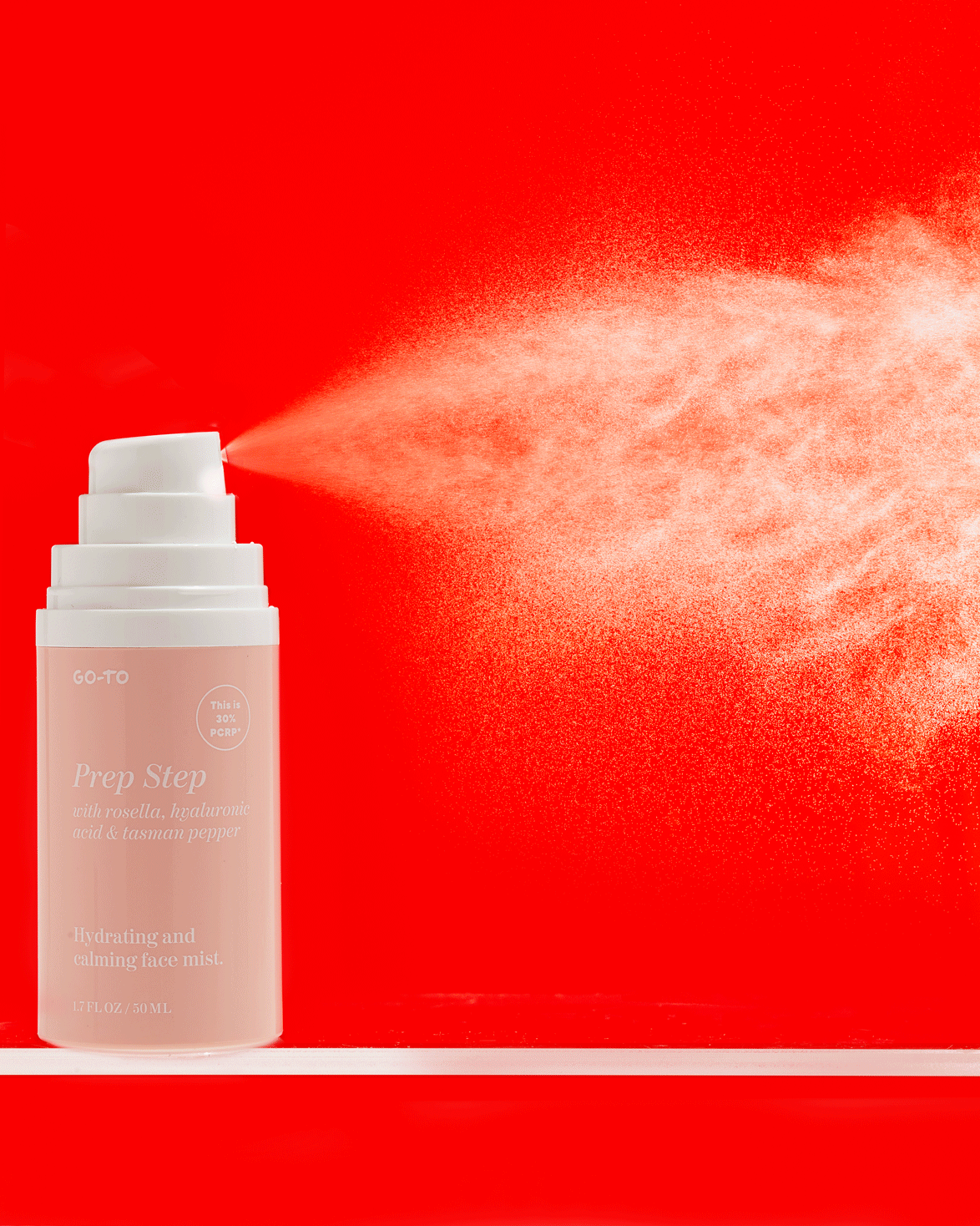
The packaging was also given a facelift. Fresh fonts, updated peach shade, product vessels updated, new design for the copy layout and new carton design.


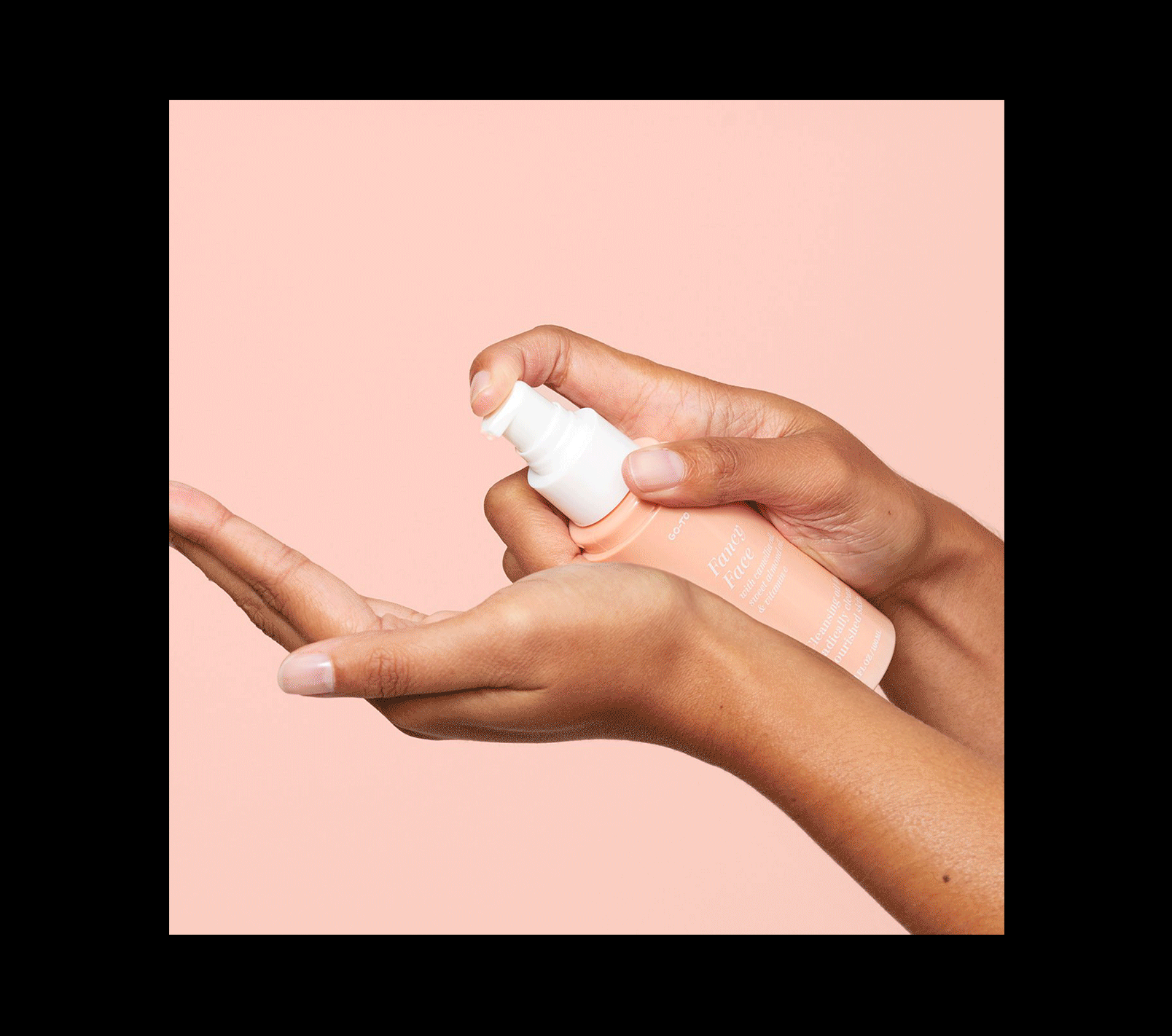
The imagery suite included product swatches; product imagery for ecommerce purposes; dynamic product imagery for all other communications purposes — including the ‘messy product shots’ and ‘hands holding products’ (which are now a recognisable part of the Go-To DNA); and evergreen model imagery — always with the intention to use a diverse range of talent and skin conditions.


Advertising across digital and out of home to help increase brand awareness and drive product sales showcasing the new imagery and brand evolution and was infused with the Go-To irreverent fun.


The Go-To website was re-platformed onto Shopify. Working with UX/UI designer Felicity Ieraci and the Go-To Skincare team. The result being a playful, dynamic online store that weaves the strong brand values throughout with a flexible framework which is able to be updated as the company’s needs have grown.
Fun routine videos and evergreen video content to focus on education, with an emphasis on playfulness and ease of use was created. The refreshed visual tone of voice, branding and styleguide was rolled out across all facets of the Go-To communication including eDMs and social.


